Do you think the visual problem is a pure beauty problem, an operation problem, or a boss problem?
The answer is that all three are related. Vision is related to art, operation, and bosses. Whether a store is well done, the boss must be clear about what they want, such as Inman and Aka. Their vision is that the boss is very clear about what his purpose is, rather than plagiarizing and following the trend when he sees what others do well.
Refined visual marketing is necessary, and data is the standard for testing truth. Of course, vision is not something that is just a blind eye to look good, but it is to let consumers know your purpose and have certain marketing purposes. Some places evaluate click-through rate, some consider stay time, etc. Today, we mainly talk about the increase in click-through rate.
A company should have standards regardless of its size. If there is no standard, then relying on individuals, it will easily lead to a downfall of the company if its employees are gone.
1. How to revolutionize the click rate of the main picture?
The main image visual is divided into search main image and recommended main image
Start with a formula: traffic = exposure * click-through rate. During the search process, we see the process of the main picture - price - evaluation - look at the details. If the main picture does not work, there will be no details page. The population segmentation, user search behavior, etc. are also used to search for a certain product. When the user searches for this product, the platform will recommend products with high sales or high evaluation to the user. Therefore, if you do all aspects well, you will naturally recommend your product, and users will also point to high sales. Under the herd effect, users will think that many people will definitely not step on the wrong side when buying them. If it were you, you should also point to high sales products.
Search main picture: When we search for a product and find that the product jumps out is not suitable for you, the search terms will be continuously extended during the search process, which will become more and more accurate. This process is to cater to the psychology, so when you first make a product with less competitive, click in to see if the product is good or not. The first screen of the details page is the core selling point of the refining product, such as brand and function. Some functions that consumers see in the first screen may prompt consumers to search for this function on the homepage. At this time, the main picture display is more advantageous.
So how to revolutionize the click rate of the main picture?
1. Data testing is very important. Let the artist choose one of the dozen main images to do. There are certain methods for data testing, such as modifying one element and not changing the other elements. Only in this way can we know which one is effective and why it is effective. Only when we do it next time, we have evidence to follow. For example, the following picture:
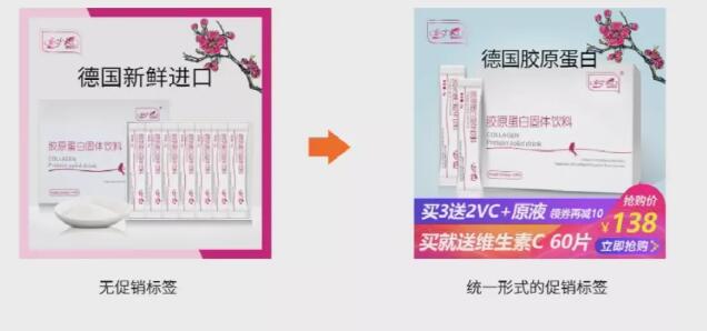
Case
You need to constantly test and then record data, such as display volume, click-through rate, modification places, etc. In the long run, you will be sensitive to data and know how to do it. Artists also need to look at it. If artists don’t know how to do it, they can easily follow the idea of operation.
2. Brand awareness is very important. How many brand words are there? For example, 70/80% of the traffic of an internet celebrity is a brand word from an internet celebrity, his name, etc. This is healthy. In the main picture, you must constantly strengthen your brand image, such as the main picture, and the avatar are all internet celebrities themselves. So what should I do if I am not an internet celebrity? Then I need to create my own brand living body, such as JD.com’s dog, Tmall’s cat, etc., as shown below:

Case
This way, the continuous repetition of this living expression is to deepen the user's impression.
▶Recommended main picture: The platform now has thousands of people, so as long as you open the platform, what you recommend is what you want most. The main picture you recommend after opening is basically very clean and tidy, and there is no promotional copywriting. So it is not enough to make a main picture. You need to make several pictures to meet the needs of the platform. The platform’s guess is that you like to capture 400 display places for recommended products in real-time personalized needs of consumers, and pay pits on 7/11/15. A super recommended display place is added. Grab the PC homepage, cater to material creativity, deer group, sku creativity, price, crowd and other related aspects to determine the paid promotion ranking. His recommendation logic is to look at A to promote A1.
At the same time, there will be some guesses you like during shopping, such as shopping cart, bottom of favorites, recommendations based on consumer browsing and purchasing behavior, and the same type of products under the product category, etc. His recommendation logic is to add A to recommend A1.
There are also recommendation scenarios that have been successfully purchased. The system filters the products for the purchased products and shows that customers may also purchase BCDE and other products. His recommendation logic is to buy A and recommend B.
Therefore, we must pay attention to the main picture. The previous high-click main picture is out of date. Now the search and recommendation traffic logic are different, and consumers' expectations for pictures have also changed.
2.5 main pictures impress consumers?
The function of the main picture is to drain and persuasion. We often look at 5 main pictures before deciding whether to read the details page. For example, the following two products are: one is 9.8 and the other is 8.5. The sales difference is very obvious.
Let’s look at product one first. The first main picture is to buy 3 get 9 free. The second main picture is to apply to several bedrooms. The third is to display the effect, and the fourth is to display the picture.
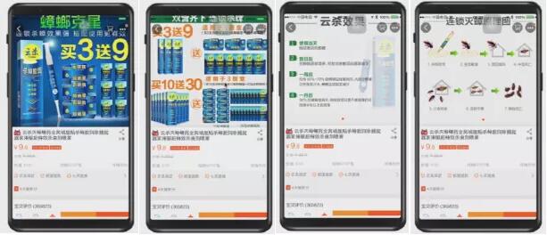
Product 1
Let’s look at product two. The first one is the main picture, the second one is the packaging, the third one is also the packaging, and the fourth picture is the effect display picture. The comparison effect is definitely not as good as the product one.
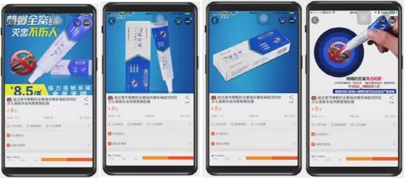
Product 2
The logic of the five main pictures:
1. The first core pain point of the customer (through evaluation and asking everyone’s opinions);
2. Functional design proves the core pain points;
3. Prove the manifestation of core pain points;
4. Patent trust letter;
5. Hot selling trust letter.
3. What are the standards for high click-through rate promotional pictures?
When consumers are surrounded by various advertising and promotional messages, how do you get your ads to get more clicks?
Good designs have strict standards, such as product composition, product layout, etc. So what are the standards for promotional pictures with high click-through rates? There are three points in this standard.
1. The main picture is highlighted
To let consumers know what you want to do, the theme should be placed at the first visual center point of the entire picture! The theme has been refined and simple and funny, and it is straightforward! For example, for promotional products, the theme is price, and the discount is combined with other promotional content itself, so this information should be placed on the visual focus and highlighted and amplified elements.
2. Product outstanding
Products are always the first visual, such as letting the product focus, preventing visual dispersion and no focus, and then grasping the unity of colors and not being too messy.
3. Reasonable layout
There are several modes of layout, most of which are 1. The left picture is centered in the right text, which is suitable for product banner. The product is on the left, which highlights the product and the copywriting is centered in the middle; 2. The left picture is lined in the right text, which is suitable for product banner products/scenes on the left, which focuses on highlighting the product/scenes, which is lined in the right text; 3. The upper and lower plate type is suitable for wireless event promotions and product displays, with the interest points up and down, which highlights the product and interest points; 4. The outer picture Chinese is suitable for event promotions, the product is around, the interest points are in the middle, which highlights product diversity; 5. The guide buttons, clear buttons and arrows will be thrown into the seller to produce psychological hints that cannot be underestimated.
4. What are the creative gameplays of high-click direct train diagrams?
▶ Creative type: combining creativity and selling points;
Selling point type: Do it according to the selling point of the product, see what consumers want to see on the main picture? What do you care about? What are you worried about? Grasp the needs of consumers. (You can review the evaluation based on the consumer consultant, look at the keywords, ask others, etc.);
▶ Event type: buy and get free, promotion, cost-effectiveness, etc.;
▶ Difference type: You can highlight differences from the competitive environment, such as subject color, background color scene, etc.
Finally, let’s talk about the wireless direct train standard. The brand logo must be placed on the main picture to facilitate consumers to remember. Then some production design and requirements can be done, such as the copywriting should be as simple as possible, the packaging should be displayed clearly on the mobile phone, the number of words should be controlled within 8 characters, the size of the picture should not exceed 1500kb, the logo should be placed in the upper left corner, the text should be standard bold, the background should be highlighted, etc. After you have set the standards, you will be given to the artist, and in the future, the artist will know how to do it.
Do you understand after reading today’s teacher’s explanation? You can analyze your own express train creative ideas and store promotion posters by yourself! May your store’s traffic and conversions increase tenfold in one month! !


![#Laogao E-commerce Newsletter# [May 18 E-commerce Morning News]](/update/1621300025l099467791.jpg)
![#Laogao E-commerce Newsletter# [E-commerce Evening News on June 18]](/update/1560849345l718478242.jpg)
![#Laogao E-commerce Newsletter# [E-commerce Evening News on April 29]](/update/1619686852l023113542.jpg)
 EN
EN CN
CN
