In this era of looking at appearance and face, any product is also inseparable from packaging. If the main picture is the stepping stone for customers to pay attention to and find our products, then the details page is the catalyst for customers to stay and buy products. What the main picture can do is to bring customers in, and the function of the details page is to keep customers and promote transactions.
Today, Taobao can no longer simply win with ultra-low prices, and customers also focus more on the product itself, the quality of the product and the needs of customers for the product. Some customers also choose small and beautiful stores to buy products. Therefore, we need to improve the selling points described in the main picture of the product and the product details page.
Even the product quality problems arising from malicious competition in low prices lead to customers’ doubts about product quality. But without exception, they will be curious and interested in products with high appearance. Everyone loves beauty. No matter how rational consumers are, they cannot resist the visual experience brought by beautiful product packaging. Therefore, when a strong main image attracts our customers to the product details page, we have taken the first step to success. Next, we need a reasonable, well-founded, and powerful details page to catalyze customers' desire to buy and promote ordering.
Although we know the importance of the details page and we have designed the details page, some sellers will find that it seems that the new details page is not as high as the previous conversion? Why did the details page, which had already racked its brains, not achieve the expected results? Perhaps when we optimized, we not only optimized the good aspects but also guessed some invisible pitfalls. Below, the editor will tell you what are the pitfalls that we are prone to overlook in detail page design.
1. Blind imitation.
When we talk about detailed page design, we often tell you to find competitors to compare and refine your selling points. But it does not mean that you should directly imitate the details page of a certain store. The editor has repeatedly popularized the knowledge of store positioning for everyone, because of the gap between each store and consumer group, and requires our details page to have its own customer group positioning. Instead of blindly finding a big store to imitate the selling points and structure. Because this is actually not the best strategy for us small and medium-sized sellers. Many sellers find that even though the product details page is imitating the big store’s high-end, it still has not been converted well. On the contrary, the previous details page is more "ugly" but more popular.
In fact, the reason is very simple. We have all the big stores we have, and the credibility and quality assurance of large stores cannot be compared with small and medium-sized sellers. If you just imitate, your store will only look a bit counterfeit and exaggerated. There are also some stores who like to use photos of the details page of large stores, not to mention this. Not only does it have its own characteristics, it may even be reported sometimes.

Solution: We can compare the advantages and disadvantages of large stores. Then find the positioning of your own store, such as women's clothing products, and position our customer group by analyzing the population portrait. It is a female college student, a female white-collar worker, or a Chinese-style European and American style, etc., and then the detailed page is positioned based on our store positioning.
We just need to take the essence of our competitors’ details pages, find our advantages and highlights, and show differentiated and personalized things. This is the only way to be unique. The details page is also one of the best ways to express your impression on customers. Regarding the use of photos, the editor has popularized various shooting techniques for photos to you before. You can find the previous articles to learn. Just master one or two is enough to achieve the desired effect. When taking photos, we should also choose the appropriate environment and background based on the positioning of our store. The photos of the clothing category can be selected by selecting the appropriate models and makeup through crowd positioning.
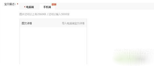
2. The PC side (computer side) is directly converted into a mobile side, without paying attention to the text size.
When designing the details page, we need to pay special attention to one thing, that is, there are two types of PC and mobile phones in Taobao. Sometimes when we design our own or ask someone to design the details page, we ignore the size of the mobile phone. The width of the mobile phone is 640. If we adjust the text to a suitable viewing size on the PC side. Since the detailed pictures on the computer are much larger than those on the mobile phone, the problem arises when it is directly converted into pictures on the mobile phone.
The text becomes too small when the mobile phone details page is displayed. It's hard to identify. This makes it a difficult time for customers to recognize text. If you meet customers who are interested in our products, you may feel depressed after trying to read the details page but failing to succeed. This not only fails to show the product selling points well, but also creates obstacles to communication between our stores and customers. Therefore, this pit must be avoided.
Solution: If we want to upload the details page to the PC and mobile phone at the same time, we might as well design the text of the product details page to a larger extent. Convenient to convert it directly into a mobile phone and can also be well identified. It is best to design two sets of details pages, after all, too large text on the PC side will also affect the effect of the picture.
3. The details page description is not refined or overly refined.
The details pages of some products are still difficult to understand. For example, the details pages of some auto parts are all professional terms. There are also some new materials. Some sellers are direct sales by manufacturers and know all about these professional knowledge, but when they come to customers, they become listening to the heavenly book. Therefore, our detailed page description is simplified. Hit the snake and hit seven inches, find the customer's pain points and describe it in concise text. Never go around a long circle and can’t tell what you want to express.
Also, I am lazy when creating the details page and uploading photos directly. The labels in some categories of products are very obvious, without any order or logic, and there is not even a text description. They directly come up with various detailed pictures, whether they are front, back, side, or various colors and styles, or various model display pictures. It makes people confused. Although this reflects the product itself, the product details page without text content makes people look neither professional nor serious.
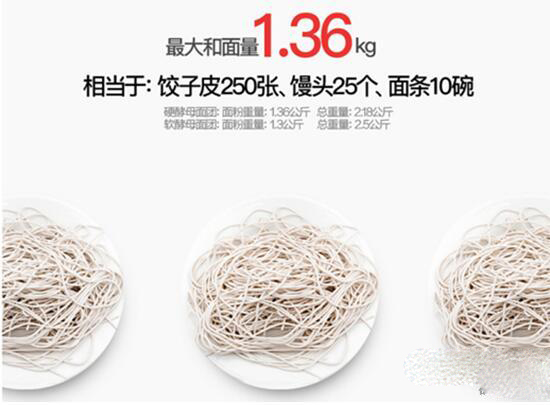
Just like the noodles in the picture above, without a text description, we think it may be just a noodles, but a good description will give you a deeper understanding of this ordinary product, so that you can better promote ordering.
Solution: Refine the selling points, and choose the picture and material to complement each other. When encountering professional terms, you must have certain annotations so that customers can recognize our products through annotations without understanding our products.
4. Over-beautification.
Of course, the main pictures of Meitu are good, but the explanation function of the detailed page cannot be ignored in order to show the beauty of the product. You cannot over-beautify the pictures. In the past, there were many cases where customers' evaluation of the products was inconsistent with the description of the picture due to excessive beautification. The main function of the details page is to explain the product. Therefore, when making the details page, our product picture and the material picture selected on the details page should be combined with the selling points of the product and the pictures that are realistic around the selling points.
Solution: While showing beauty, you must also take care of the customer's demands. Don’t transition to photo editing, be realistic, and make product pictures look good while being close to the real thing to the greatest extent, combining text with pictures.
5. Advertising is arbitrary.
Some advertisements and related products can appear in the details page, but this does not mean that a large number of products from recent event posters stores are piled up on the details page. Because when customers enter this baby, the first thing they care about is the baby itself, not to watch a lot of advertisements. Therefore, related products can be made, but not too many.
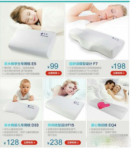
Solution: When we make related products, we can choose 3-6 models that are most suitable, and the space that takes up should not be too large. Otherwise, it will easily cause disgust of customers. The activity poster can not exceed three at most, and most details pages can only put one activity poster to the best effect.
6. The content is not loading smoothly.
Some sellers always feel that the details page are not detailed enough and continue to increase the content of the page. This will cause the image to load too slowly and will also consume the customer's patience. (A word of mouth, I have some essential forms here. If you need them, you can read my introduction at the end of the article, and there is a way to obtain them). The content of the picture must be displayed with a good grasp of the standard. The average stay time for buyers on the details page is 70 seconds. 50% of buyers turn off the page in less than 30 seconds. The average stay time for wireless buyers on the details page is only 15 seconds. If the page content is too much and the page is too long, the buyer will run away before the page is loaded in 15 seconds.
Therefore, if the details page pictures are too large and too many, users will obviously feel the program is stuttered. It has a great impact on the buyer's experience. Therefore, in order to give buyers a better experience on mobile devices, the total number of pictures should not exceed 8 and the total length should not exceed 10 screens. In terms of conversion rate, the conversion rate of details pages with lengths exceeding 10 screens has been significantly reduced.
So when we are doing Taobao operation and e-commerce operation, we need to discover which ones can be optimized and adjusted so that we can easily obtain traffic. For operations, we must include all aspects. E-commerce operation training (http://www.shxuanming.net) - Promoted network. You can consult us online or submit a message online, and we will bring you a diagnosis to your store.


![#Laogao E-commerce Newsletter# [E-commerce Morning News on July 16]](/update/1519779573l517616211.jpg)


 EN
EN CN
CN
